06 · SleekFlow · 2025 — 2026
Mobile Analytics
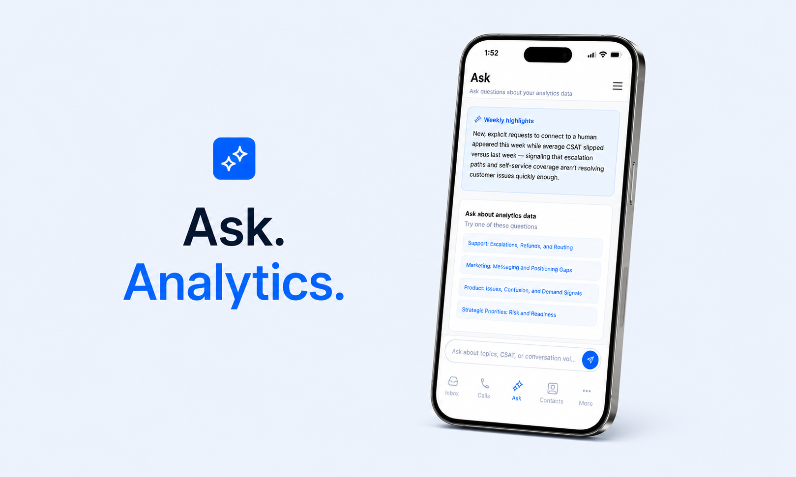
Rethinking how managers access analytics on mobile — from dashboards to conversational AI.
Client
SleekFlow
Role
Research, UX Design
Year
2025 — 2026
Focus
The Observation
SleekFlow's desktop analytics suite gives managers deep visibility into performance. Mobile is a different context entirely — managers are between meetings, in transit, or checking in during a 2-minute window. They don't need charts. They need answers.
The Problem
Mobile wasn't being used for analytical exploration — it was being used for spot-checks and urgent questions. The existing mobile interface was the same dense dashboard designed for desktop sustained attention.
The arc
- 01
Overview
Rethinking how managers access analytics on mobile.
- 02
Discovery
Understanding the mobile manager moment
- 03
UX
How the idea came to be
- 04
Reframe
Three insights that unlocked Ask
Stage 01
Overview
Rethinking how managers access analytics on mobile.
SleekFlow's desktop analytics suite gives managers deep visibility into performance — conversation volume, team efficiency, campaign results, CSAT. It's built for sustained attention, filters, and exploration.
Ask is the result of that reframe — a conversational AI interface that queries SleekFlow's analytics data and returns insights in plain language. No dashboards. No filters. Just a question and an answer.
Stage 02
Discovery
Understanding the mobile manager moment
Understanding the mobile manager moment
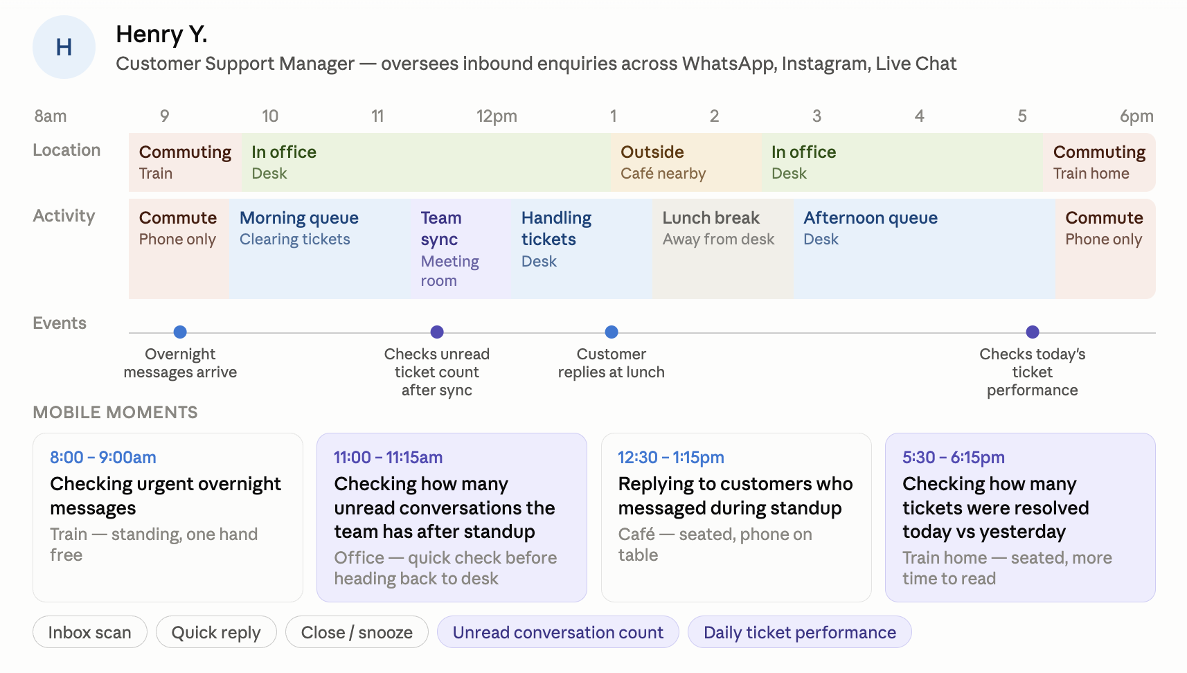
It's 5:45pm. Tim, an Operations Manager, is on the train home after a day of back-to-back meetings. He never made it back to his desk after lunch. Before he gets home, he wants to know one thing: how did the team actually perform today?
Customer journey mapping
Rather than starting with in-app data, we started with the user's day. Five SleekFlow user types, mapped hour-by-hour — physical location, activity, events happening to them, and the mobile moments in between.
What managers actually ask
Interviews with team leads, operations managers, and customer success heads surfaced a consistent pattern. The questions weren't analytical — they were direct.
- 💬"How did we perform this week compared to last?"
- 💬"Is our CSAT dropping and why?"
- 💬"Which team is handling the most volume right now?"
- 💬"Did the morning broadcast go out and how is it performing?"
These are natural language questions. They already had an answer format in mind — not a chart to interpret, but a sentence that tells them what they need to know.
~65%
Of mobile sessions lasted under 3 minutes
The majority were single-task: open, find the signal, close
Stage 03
UX
How the idea came to be
Idea 1
Compressing the analytics dashboard
The natural move was to take what we built — KPI tiles, bar charts, heatmaps, filters — and compress it onto a smaller screen. We tested the compressed dashboard with five users from the commercial team — sales leads, a marketing manager, and an account owner who all relied on mobile during client-facing hours. The feedback was consistent and blunt.
I'm standing in a client's lobby. I don't have time to tap through three filters to find one number.
On my laptop I can read this fine. On my phone I just see a wall of small bars and I give up.
Idea 2
A single summary page
The next idea was more conservative: instead of the full dashboard, build a single summary page. A handful of KPI numbers, a couple of the most-used metrics, no filters, no charts requiring interaction.
🥳 What worked
- →Removing filters and interaction was the right call — nobody missed them
- →A handful of numbers, well labelled, was genuinely faster to scan than a chart
- →Users said it felt "less overwhelming" than the dashboard attempt
🤔 What didn't work
- →A static set of numbers still required the user to interpret what the numbers meant. "Conversations: 340" doesn't tell you if that's good or bad without a comparison.
- →Every user had a different number they cared about most. A one-size-fits-all summary either included too much (back to overwhelming) or left out the one thing a specific user wanted.
- →It still couldn't answer a follow-up question. If the summary showed CSAT had dropped, there was no way to ask why — the user would have to go back to the full dashboard anyway.
This is better, but I still don't know if 340 is good. And if something looks off I still can't dig into it from here.
Stage 04
Reframe
Three insights that unlocked Ask
Managers already have a question
They don't open the app to explore data — they open it because something specific is on their mind. The interface should answer the question, not make them find it.
They need answers, not charts
A chart is a tool for discovering an insight. A manager on mobile wants the insight. The translation — from raw data to interpretation — should happen in the product, not in the manager's head.
Some signals should come to them
If CSAT dropped this week while escalation requests spiked, a manager shouldn't have to ask. The most important signal should already be surfaced when they open the app.
Outcome
Outcome
01 — What gets surfaced automatically
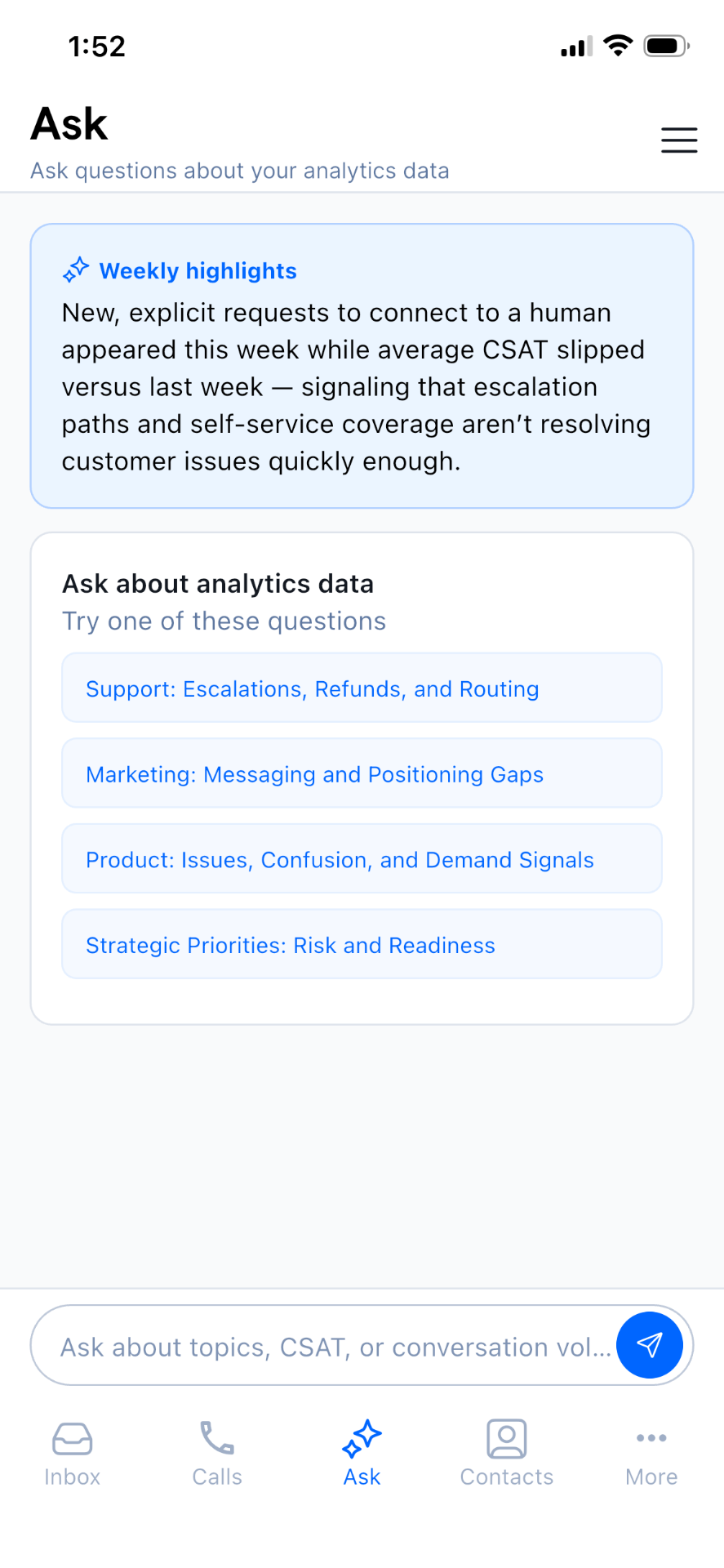
Rather than requiring a query every time, Ask surfaces a weekly highlight on the home screen — an AI-written narrative summary of the most important signal from the past week. A manager opening the app sees the key insight immediately, without having to ask for it.
02 — How to lower the entry barrier
Not every manager wants to type a free-form question, especially on mobile. Ask provides four suggested questions covering the main analytical areas — Support, Marketing, Product, and Strategic Priorities. These are pre-formed prompts a manager can tap directly, making analytics accessible even in a 60-second window.
03 — How to build trust in AI-generated answers
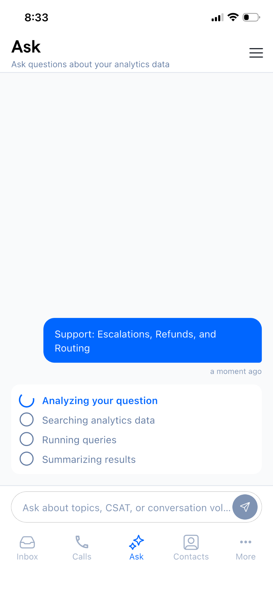
A core risk with conversational analytics is that users don't trust the answers — they don't know if the AI is querying real data or generating a plausible-sounding response. Ask addresses this with transparent reasoning states: Analyzing your question → Searching analytics data → Running queries → Summarizing results. Users can see the system doing real work.
What shipped in Ask
- ✨Weekly AI-written highlight on the home screen
- ✨Four tap-to-ask suggested questions across Support, Marketing, Product, Strategic Priorities
- ✨Free-form natural language input for follow-ups
- ✨Transparent reasoning states during query execution
- ✨Built on the same analytics infrastructure as the desktop revamp
Reflection
Stubborn about the summary page
After the dashboard attempt failed, the summary page felt like the obvious fix — fewer numbers, no filters, cleaner layout. I was ready to call it a win. The project lead pushed back: we were still asking users to do the work themselves — interpret a number, decide if it was good or bad, and go elsewhere if they wanted to understand why. They were right — the summary page was a smaller version of the same problem, not a different solution. That pushback is what got us to Ask.
Fun, because AI sat at the core — not bolted on
Most of my work up to this point was structural — IA, navigation, interaction patterns. Ask was different. The interesting design problems were about how to make an AI-generated answer feel trustworthy and consistent, not just how to lay out a screen.
The hardest part was AI consistency, not the query mechanism
The team had already built an internal CX dashboard where users could query SleekFlow data conversationally — so the capability wasn't new. What made Ask hard was keeping the AI's answers consistent and making sure it pulled the right information every time. The same question asked twice needed to surface the same insight. Ask is built on top of the same analytics infrastructure as the desktop dashboards — the Analytics Revamp and Ask aren't separate projects; they're two layers of the same system.