03 · SleekFlow · 2025
Analytics Suite Revamp.
Redesigned SleekFlow's analytics from a wall of widgets into a role-based decision-making tool — purpose-built dashboards that answer the questions managers actually ask.
Client
SleekFlow
Role
Product Designer
Year
2025
Focus
The Observation
As companies scale digital engagement, analytics has become table-stakes across omnichannel platforms. Market leaders now offer role-based dashboards, flexible filters, and real-time data. SleekFlow's existing analytics lagged these standards significantly. The offering had basic metrics — average response time, conversation volume — but no role-specific insights, no ability to diagnose root causes, and no consistent way to slice data by channel, team, or time. Customers were exporting to HubSpot, Google Studio, and Excel to do the analysis the product should have given them. This wasn't just a usability problem — it was a competitive gap directly impacting win rates, adoption, and retention.
The Problem
Three failure modes emerged from research: data was too high-level to be actionable, users couldn't slice or drill into it to investigate root causes, and dashboards weren't named or designed around specific user goals — making the whole experience feel disjoint and forcing users to re-learn the tool for each section.
The arc
- 01
Thinking
Analytics as a competitive gap, not a usability one.
- 02
Doing
Research that grounded every design decision.
- 03
Shipping
From wall of widgets to role-based decision tool.
Stage 01
Thinking.
Analytics as a competitive gap, not a usability one.
As companies scale digital engagement, analytics has become table-stakes across omnichannel platforms. Market leaders now offer role-based dashboards, flexible filters, and real-time data. SleekFlow's existing analytics lagged these standards significantly.
The offering had basic metrics — average response time, conversation volume — but no role-specific insights, no ability to diagnose root causes, and no consistent way to slice data by channel, team, or time. Customers were exporting to HubSpot, Google Studio, and Excel to do the analysis the product should have given them.
This wasn't just a usability problem. It was a competitive gap directly impacting win rates, adoption, and retention.
- →No actionable insight — data was too high-level. Users could see response time was high, but couldn't drill into why. A metric without context isn't insight, it's noise.
- →No ability to investigate — critical breakdowns were missing. Users couldn't slice by channel, team, agent, time, or market. Heatmaps, funnels, and comparative analysis were absent.
- →Confusing and disjoint experience — dashboards weren't named or designed for a specific user goal. Layout, filter behaviour, and visual style were inconsistent across sections.
For the marketing team, we'd like to know how each market is performing, but we can't get this data in the analytics so we use HubSpot to drill it down.
I want to know how much workload each team is taking so I can allocate resources properly.
I want to know which teammate is performing well so I can compensate them properly.
Stage 02
Doing.
Research that grounded every design decision.
Competitor analysis
Mapped analytics capabilities across Respond.io, Intercom, and Zendesk — identifying gaps in SleekFlow's offering across conversations, performance, campaigns, agent-level data, real-time dashboards, and AI analytics.
Discovery calls with internal stakeholders
Ran structured sessions with six internal leaders across Marketing, CS, CSM, and Sales — mapping their day-to-day metrics needs, current workarounds, and specific pain points.
- →Marketing — budget allocation by region, campaign ROI, deal attribution.
- →CS / CSM — team workload, response times, SLA compliance, agent leaderboard.
- →Sales — pipeline stage progression, first response time, conversion rates.
- →All roles — inability to compare more than 2 segments, no dimensional drill-downs, manual Excel exports.
Canny requests
Reviewed product feedback — label-based filtering, API segment exports, campaign comparison limits, branch-specific opening hours in metrics — prioritising what real customers were actively asking for.
Stage 03
Shipping.
From wall of widgets to role-based decision tool.
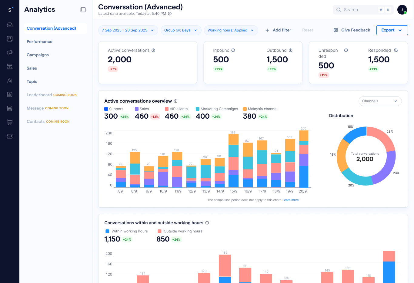
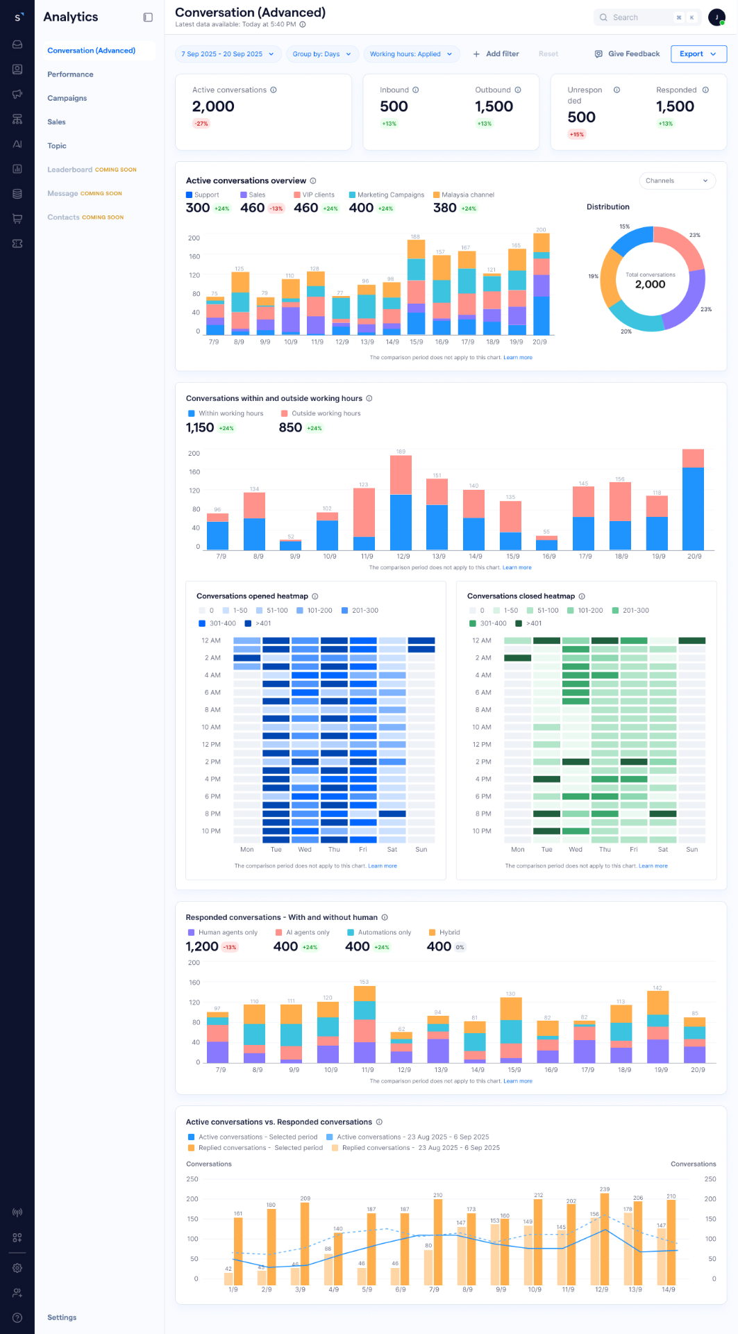
Decision 1 — Role-based dashboard architecture
Rather than one generic analytics page, I designed purpose-specific dashboards — each named for the question it answers and the user who needs it. Each dashboard has a single primary user and a single primary question it answers.
- →P0 (Phase 1) — Real-time Operations, Conversation, Performance (Overall / Team / Agent), Broadcast / Campaign, Leaderboard, Contacts, Message.
- →P1 (Later) — AI Agent, Contact Lifecycle, Topic, Conversion.
- →P2 (Future) — Bot Performance, Ticket, Sales.
Decision 2 — Three reading levels
Every dashboard was designed around three reading levels: glance (KPI cards), compare (charts), drill-down (tables). This mirrors how operators actually scan numbers — headline first, trend second, breakdown third.
Decision 3 — A principled chart system
Designed a consistent chart system with clear rules for when to use each type, documented with a when-to-use / when-not-to-use principle — giving the team a shared language for data visualisation decisions going forward.
- →KPI cards — at-a-glance headline metrics with comparison periods.
- →Line charts — continuous trends over time (max 7 lines per chart).
- →Vertical bar charts — discrete time periods and category comparisons.
- →Horizontal bar charts — rankings and long category labels.
- →Donut charts — distribution across 3–6 categories.
- →Heatmaps — time-based patterns (peak hours, busiest days).
- →Tables — exact values for drill-down detail.
Decision 4 — Consistent empty and error states
Designed three states for every dashboard: with connected channels, without channels connected, and connection error. Previously these states were either missing or inconsistent, causing confusion when users first set up the product.
- →Improved clarity in understanding performance metrics.
- →Reduced time-to-insight — managers could decide directly in the product instead of exporting.
- →Increased usability of analytics features across all user roles.
- →Stronger alignment between data and business decision-making.
- →Clearer onboarding for new accounts through purpose-specific dashboards.
- →Reduced reliance on external tools like HubSpot and Google Studio for data that now lived natively in SleekFlow.
Outcome
Improved clarity in performance metrics, reduced time-to-insight, and stronger alignment between data and business decisions — with reduced reliance on external tools like HubSpot and Google Studio.
Reflection
Data visualisation is editorial work. The hardest part wasn't designing charts — it was deciding what story each dashboard should tell and in what order. Every layout decision was a decision about what managers should pay attention to first. Getting the information hierarchy right reduced time-to-insight more than any visual improvement could.