02 · SleekFlow · 2024 — 2026
Flow Builder Evolution
I led the design of Flow Builder across multiple phases — from replacing a rule-based system with a visual canvas, to redesigning the advanced builder around a deeper understanding of how users actually think about automation.
Client
SleekFlow
Role
Research · UX Design
Year
2024 — 2026
Focus
The Observation
Automation was one of SleekFlow's most critical capabilities — the engine that let businesses scale customer communication without scaling headcount. But as customer needs grew more complex, the automation system struggled to keep up. This case study covers the full journey across two phases — what we built, what we learned, and how we kept improving it. A note on the phases: this wasn't a planned two-phase roadmap. The split emerged organically — as complexity grew, expanding the existing builder would have created too much technical debt. Advanced Flow Builder was the cleaner path forward, built on everything we learned from the first version.
The Problem
Before Flow Builder, automation worked well for simple workflows but struggled with complexity. Workflows were rule-based and restrictive, users struggled to understand the logic end-to-end, and complex flows were difficult to build and maintain. Replace rule-based automation with a flexible visual workflow builder; help users understand and trust what they're building; reduce setup friction for non-technical users; support branching logic, multi-channel routing and sequential journeys; and grow automation adoption across the platform.
The arc
- 01
Phase 1
Flow Builder V2 — from rules to a visual canvas.
- 02
Phase 2
Advanced Flow Builder v3 — diagnosing after shipping.
- 03
Insights
Five patterns that explained the confusion.
- 04
Decisions
Four moves to close the gap.
- 05
Opportunities
Two capabilities identified for the roadmap — outside this redesign's scope, but flagged as the next high-value bets.
Stage 01
Phase 1
Flow Builder V2 — from rules to a visual canvas.
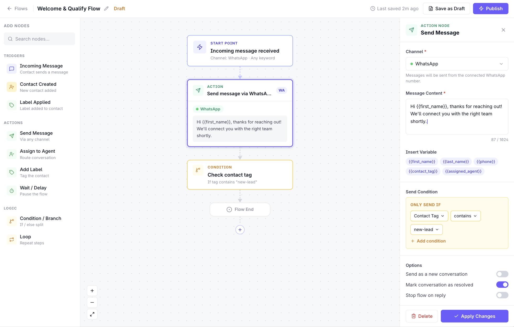
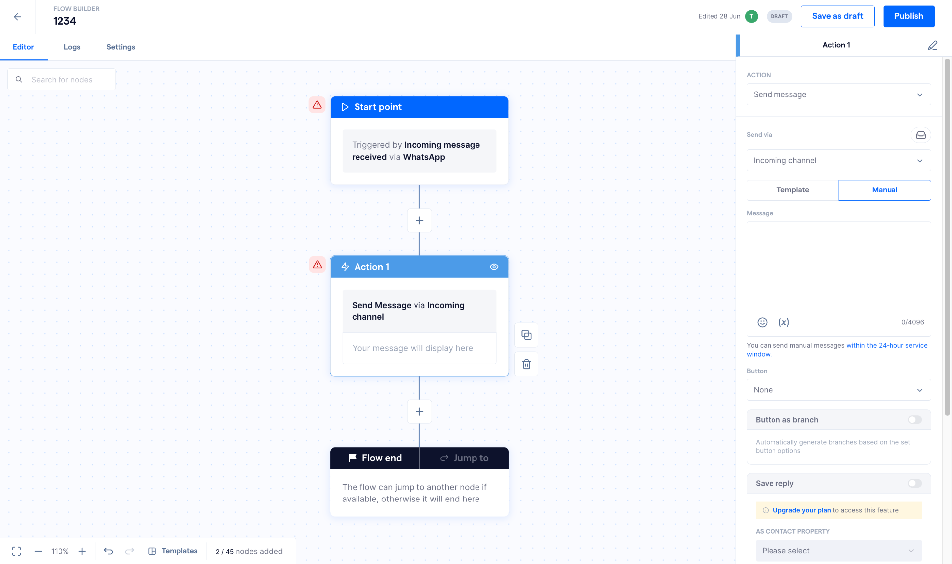
The first version of Flow Builder introduced the core shift: from a list of rules to a node-based visual canvas. Users could now see their entire workflow as a connected graph — trigger at the top, actions and branches flowing downward, end state at the bottom.
The functional node taxonomy was defined collaboratively with the PM and lead engineer. They determined what the system needed at a data level — what counted as a trigger, an action, a condition, a control node. My job was to take that functional structure and make it learnable: a user looking at the canvas should immediately understand what each node did, how they related, and what came next.
References
Zapier
Set the bar for clarity of trigger-action relationships.
Direct competitors
Respond.io, WATI, Freshchat, Gorgias — what our users were arriving from.
Working with engineering — designing within real constraints
Node repositioning wasn't possible in v1: the backend stored flow logic as a sequential tree, so position data didn't exist in the schema. Drag-to-copy was deferred too — duplicating a node means deep-cloning configuration, resolving dependency references, and generating new IDs; without a safe clone function on the backend, copying mid-flow risked breaking downstream logic. We handled reusability through templates instead. These weren't blockers — they were decisions made early so I could design within real constraints.
What launched in Phase 1
- 🚀Visual canvas with drag-and-drop node placement
- 🚀Start point node with trigger configuration
- 🚀Action nodes — send message, assign team, update contact, wait
- 🚀Branching logic via condition nodes
- 🚀Flow end / Jump-to node
- 🚀Side panel configuration for each node
- 🚀Save as draft + Publish states
- 🚀Basic templates
KPIs we tracked
- 📊Activation rate — % of accounts that created at least one flow
- 📊Workflow completion rate — % of users who published their first flow
- 📊Average workflows per account
- 📊Automation usage across account tiers
Stage 02
Phase 2
Advanced Flow Builder v3 — diagnosing after shipping.
Advanced Flow Builder wasn't born from user research. It was a technical decision — Classic Flow Builder's architecture had limitations that would compound as the product scaled. Rather than patching an increasingly brittle system, the team rebuilt on a stronger foundation that could support more complex logic, more channels, and more users.
Once AFB was live, I ran a focused research effort to understand the new failure patterns. This wasn't discovery before building — it was diagnosis after shipping.
Methods stack
- 🧪Session recordings — hesitation, restarts, switching to help docs
- 🧪NPS + support tickets to surface common failure points
- 🧪Canny feature requests — template previews, repositioning, multi-trigger, subflows
- 🧪Outside-in competitive replication in ManyChat, Respond.io, Intercom, Make.com
- 🧪Quantitative product data via Tableau and Userpilot
- 🧪Moderated pilot sessions + post-workflow Userpilot survey
- 🧪Direct observation of three users across first-time, template-onboarded, and power scenarios
73%
Did not find AFB clearly easy
Post-workflow Userpilot survey (perceived ease 1–3). 30% cited logic complexity, 29% cited discoverability.
Stage 03
Insights
Five patterns that explained the confusion.
The entry experience assumed a mental model users hadn't formed yet
The trigger modal was the very first thing users saw — before they'd explored the canvas. Users were being asked to commit to a trigger before they knew what they were building. Compounding this: a Classic vs Advanced choice at entry, with no meaningful guidance. ~60% of users who entered the builder did not complete their first flow; drop-off peaked at trigger selection.
The system allowed users to build broken things without knowing it
A user could set a Facebook Messenger trigger, then configure a Send Message via WhatsApp using "incoming channel" — a logically impossible combination the builder allowed. Flows failed silently in production with no indication of why. Disabled options appeared greyed out with no context. Flow configuration errors were among the top 3 support ticket categories.
Templates were being used as reassurance, not speed
Users weren't picking templates for a head start — they were browsing to understand what automation was even capable of. Previews didn't show enough; descriptions were too brief to evaluate fit. Session recordings showed 3–5 minutes of template browsing before selection — or abandonment. Templates had become a coping mechanism for an absent onboarding model.
When things went wrong, users debugged outside the product
A power user's workaround system had no business existing: "Unread" as a manual pin, jumping between Inbox and Flow Builder, checking channel health separately, cross-referencing contact properties. Zero traceability inside the builder — no way to see which flow fired, which branch matched, or why a message did or didn't send.
4+
Screens to diagnose a single flow issue
Average in observed sessions. None of that context existed inside the builder itself — an observability gap that was invisible until you watched someone try to fix a live issue.
Trust was destroyed at specific high-stakes moments
Canvas wipe on inactivity. Content cleared when switching channels mid-node. No autosave. One session note described coming back to a blank canvas as "traumatic." ~70% of active accounts only used simple single-step flows — multi-branch, multi-channel workflows were being avoided entirely. Trust is the prerequisite for capability.
Stage 04
Decisions
Four moves to close the gap.
01 — Fix the entry: remove the commitment barrier
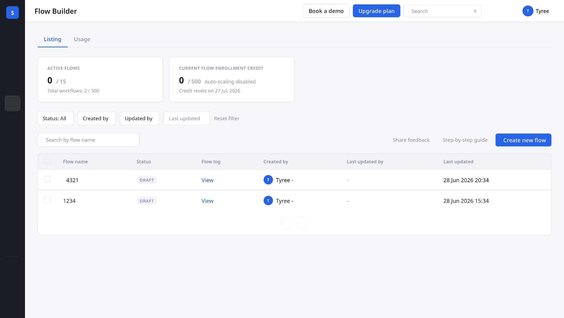
Users needed to explore the canvas — see node types, understand the structure — before being asked to lock in a trigger. Introduced an improved empty state with contextual guidance, deferred trigger commitment so users could explore node types first, and removed the CFB vs AFB choice at entry with routing handled behind the scenes based on use case.
02 — Prevent broken flows before they ship
Validation moved from publish-time to build-time. Inline error states on nodes flagged issues as you build, channel mismatch warnings surfaced immediately, disabled options carried contextual explanation ("Button as branch is only available for WhatsApp channels"), and an error count in the top bar gave direct navigation to the problem node.
03 — Make templates a discovery tool, not just a shortcut
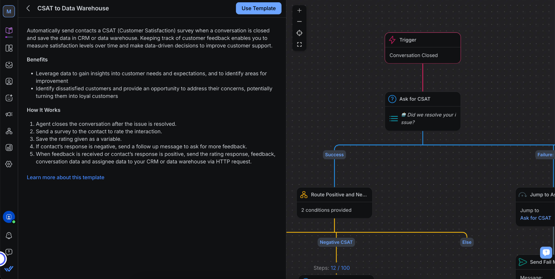
Richer template previews — full flow visible before committing, with use case and channel requirements. Templates organised by use case (lead qualification, onboarding, abandoned cart) rather than by trigger type. "Used by X accounts" social proof to build confidence in templates users hadn't considered.
Stage 05
Opportunities
Two capabilities identified for the roadmap — outside this redesign's scope, but flagged as the next high-value bets.
Opportunity 1
Subflows — call another flow
The clearest unmet need from power users was the ability to call a reusable subflow from within a larger flow. Update logic once and it propagates everywhere. Break 50-node flows into clean, modular components. Maintain consistency across teams.
Competitors — ManyChat, Respond.io, Make — already support this, making it an expectation for users building at scale. Identified as a high-priority roadmap item but outside the scope of this redesign.
Opportunity 2
Conversation-origin triggers
SleekFlow's triggers were simple: when a message arrives, start the flow. It didn't matter how or why the conversation started — the same flow fired regardless.
But for businesses running paid campaigns, this created a problem. A customer who clicked a Facebook ad and messaged you is different from someone who reached out organically. They have different intent, came from a different context, and should receive a different response. Without knowing what opened the conversation, you couldn't personalise at that level.
Respond.io had already solved this — their triggers could distinguish between a conversation opened by an ad click, an API call, a workflow, or a user typing directly. That meant you could send a targeted welcome message to ad-driven conversations, and stay silent on system-generated ones where no real human had reached out yet.
This gap was documented and flagged for the product roadmap as a high-value capability for mid-market and enterprise customers.
Reflection
Could we have skipped Classic Flow Builder and built one definitive version?
In hindsight it's tempting to think so — but I don't think it would have worked. Classic Flow Builder wasn't a mistake, it was a validation step. We needed to confirm that users could work with a visual canvas at all before investing in a more sophisticated architecture. The instinct to "just ship the right thing first" assumes you know what the right thing is — and we didn't, not yet. Classic gave us real usage patterns, real failure modes, and real confidence that the visual model was worth building on. AFB was better because Classic existed, not in spite of it. That said, if I were starting again, I'd push harder for a UI design investment to happen in parallel with the AFB technical rebuild — not after. The mistake wasn't having two versions. It was letting the frontend lag behind the backend, which meant users inherited a more powerful system that was actually harder to use. Research and design should have been running alongside engineering from the moment the rebuild decision was made, not reactive to the confusion it caused after launch.
On the trigger modal — what I'd do differently
The trigger-first entry was a known problem from early observation sessions. Users consistently froze at it, but it kept getting deprioritised because fixing it required rethinking the entry flow — not just a UI tweak. In hindsight, that was the wrong call. The entry experience is where first impressions form and where most users were dropping off. Fixing the highest drop-off point in the funnel should have been the first thing on the list, not something deferred until the rest of the system was stable.
What I'm most proud of
The research practice I built around AFB. Nobody asked me to run observation sessions or do a competitive analysis from the outside-in. I initiated it because the support signals and NPS data suggested something deeper was wrong than what the metrics alone could explain. The Five Insights that came out of that research gave the whole team — design, product, engineering — a shared diagnosis of the problem. Instead of debating individual fixes, we could ask: "does this address the root cause?" That's the kind of design thinking that creates alignment and moves faster.