04 · SleekFlow · 2022 — 2025
Design System
Client
SleekFlow
Role
Systems lead
Year
2022 — 2025
Focus
Overview
At SleekFlow, multiple product teams were building features simultaneously across CRM, Contacts, Analytics, Broadcast, Flow Builder, and Settings.
Although each product solved different business problems, many shared the same interaction patterns—tables, forms, dialogs, filters, navigation, and other common UI elements.
As the platform grew and more designers joined the team, maintaining consistency became increasingly difficult. Different teams began solving the same problems in slightly different ways, resulting in duplicated work and an inconsistent experience across the platform.
To address this, we invested in a reusable design system that enabled teams to work faster while creating a more scalable and consistent product experience.
My role
- →Defined how components are structured, displayed, and used across product surfaces.
- →Created guidelines on the anatomy of each reusable component — how to use it, when not to use it, and edge cases to watch for.
- →Provided templates so new designers could jumpstart their features without rebuilding foundations.
- →Built in flexibility so different designers could adapt components to their own flows without breaking the system.
- →Collaborated with designers and engineers on system logic and constraints.
Goal
By creating this design system, we wanted to:
- →Maintain consistency across products.
- →Reduce repetitive design work.
- →Improve collaboration between design and engineering.
- →Scale as the platform continued to grow.
- →Allow designers to focus on solving product problems instead of recreating UI.
System architecture
To keep the library maintainable, we separated the design system into two libraries.
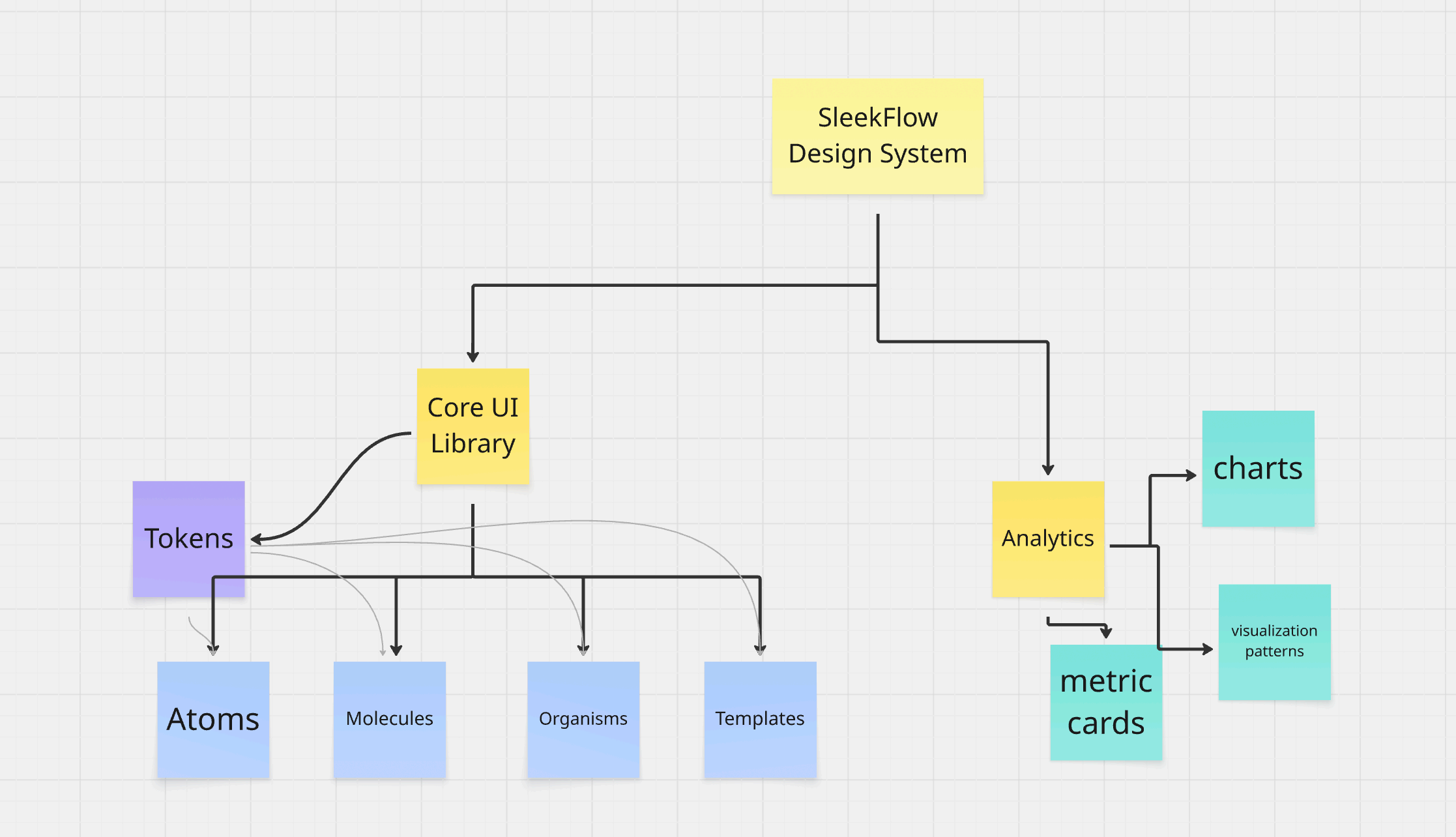
Core UI Library
This library contained reusable interaction patterns shared across the platform — forms, dialogs, navigation, tables, buttons, and common interface elements.
We loosely organised the design system using Atomic Design principles. Rather than focusing on every individual component, the goal was to progressively build reusable building blocks that could support increasingly complex product experiences.
Analytics Library
Analytics introduced many specialised components — charts, metric cards, visualisation patterns, and dashboard layouts.
Because these components were only relevant to analytics products, separating them into their own library reduced unnecessary complexity and let designers work with only what was relevant to their projects.
Foundation layer (tokens)
The design system was built upon a hierarchy of design tokens, semantic tokens, and reusable components.
The visual language itself was led by our brand designer, but as I built more reusable components, we worked closely together to continuously refine the token system. Rather than treating tokens as something fixed, we evolved them as new product scenarios emerged.
For example, during implementation we realised certain semantic colours weren't specific enough for different product contexts. Together we refined the token definitions so designers could make consistent decisions without guessing which colours to use.
The design system became a living library that evolved alongside the product.
Example: the table component
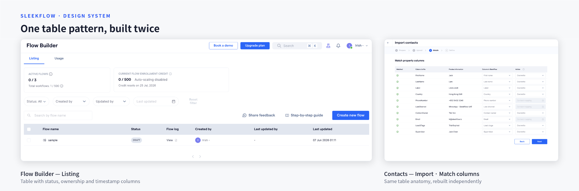
The data table was one of the most challenging components I worked on.
Tables are one of the most heavily used interaction patterns in enterprise software, but they're rarely just rows and columns. A table in contact management behaves differently from one in user management settings, which behaves differently again from one in label management.
🤔 Some of the factors we had to reason about:
- →Number of rows vs. the available page width — if there are only two rows but the table stretches across a wide container, it becomes harder for users to scan related information efficiently.
- →Whether users need to edit information directly within the table, or select rows to perform bulk actions.
- →When to use different pagination patterns.
- →How to handle overflowing text — wrap onto multiple lines or truncate? — and how hover actions affect the layout.
- →When to use text buttons vs. icon buttons for row-level actions.
🔍 Sample guidelines
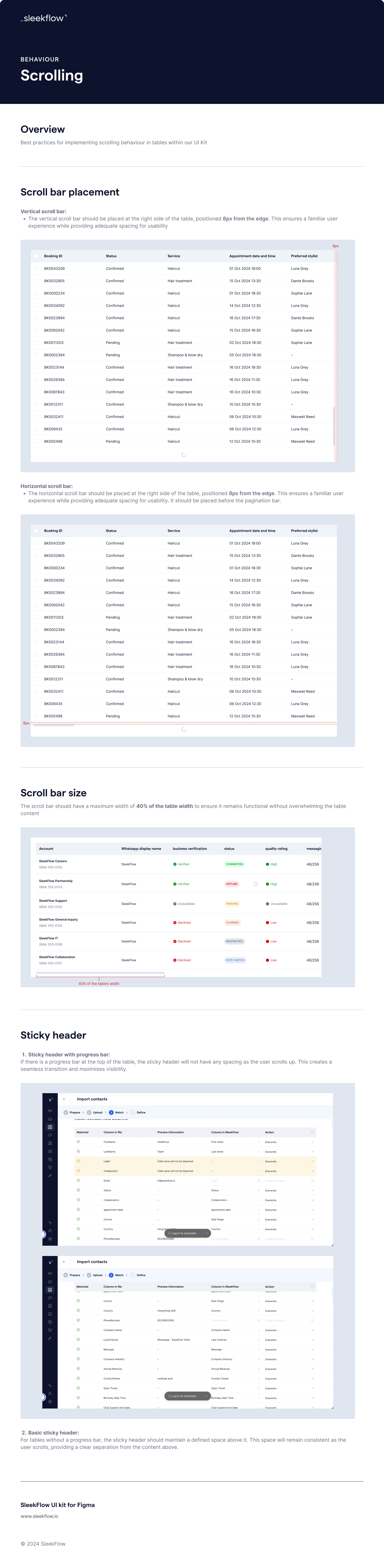
Each component in the system shipped with a written spec covering behaviour, anatomy, and edge cases. A few pages from the table guidelines: