05 · WeCreate Labs (Agency) — Pacific Cross Insurance · 2022
Pacific Cross Insurance — Website Revamp.
Redesigned an insurance website for three distinct audiences without making any of them feel like an afterthought.
Client
WeCreate Labs (Agency) — Pacific Cross Insurance
Role
Art direction · UI/UX · Web design
Year
2022
Focus
Context
Pacific Cross is a health and travel insurance provider operating across ASEAN — serving individuals, families, corporate groups, brokers, and medical providers all from the same digital platform. The existing site tried to serve everyone and ended up serving no one particularly well. The challenge was designing a cohesive digital experience that could speak to a B2C individual buying their first travel policy, a B2B decision maker comparing group plans, and a medical provider applying for accreditation — all without the experience feeling fragmented or generic.
Problem
Insurance websites have a visual problem: they tend to default to either cold corporate sterility or aggressive sales energy. Neither builds the trust that insurance actually requires. Pacific Cross needed something that felt credible and warm — a brand that genuinely believed it was making people's lives better, not just selling them a product. At the same time, the information architecture was genuinely complex. Multiple user types, multiple product categories, multiple journeys — and they all needed to find what they were looking for without confusion.
Approach
- 01
Ran a structured audience analysis mapping three distinct user groups: B2C (local and expat individuals and families making personal insurance decisions, often with little prior knowledge), B2B (decision makers for large and small groups — rational, comparison-driven, focused on plan details and value), and Partners/Employees (brokers, talents, medical service providers needing quick access to specific tools and accreditation).
- 02
Mapped primary and secondary personas with detailed journey flows — what they come to the site to do, where they go, what they need at each step, and what friction points exist along the way. This ensured the navigation structure and page hierarchy served real behaviour, not assumed behaviour.
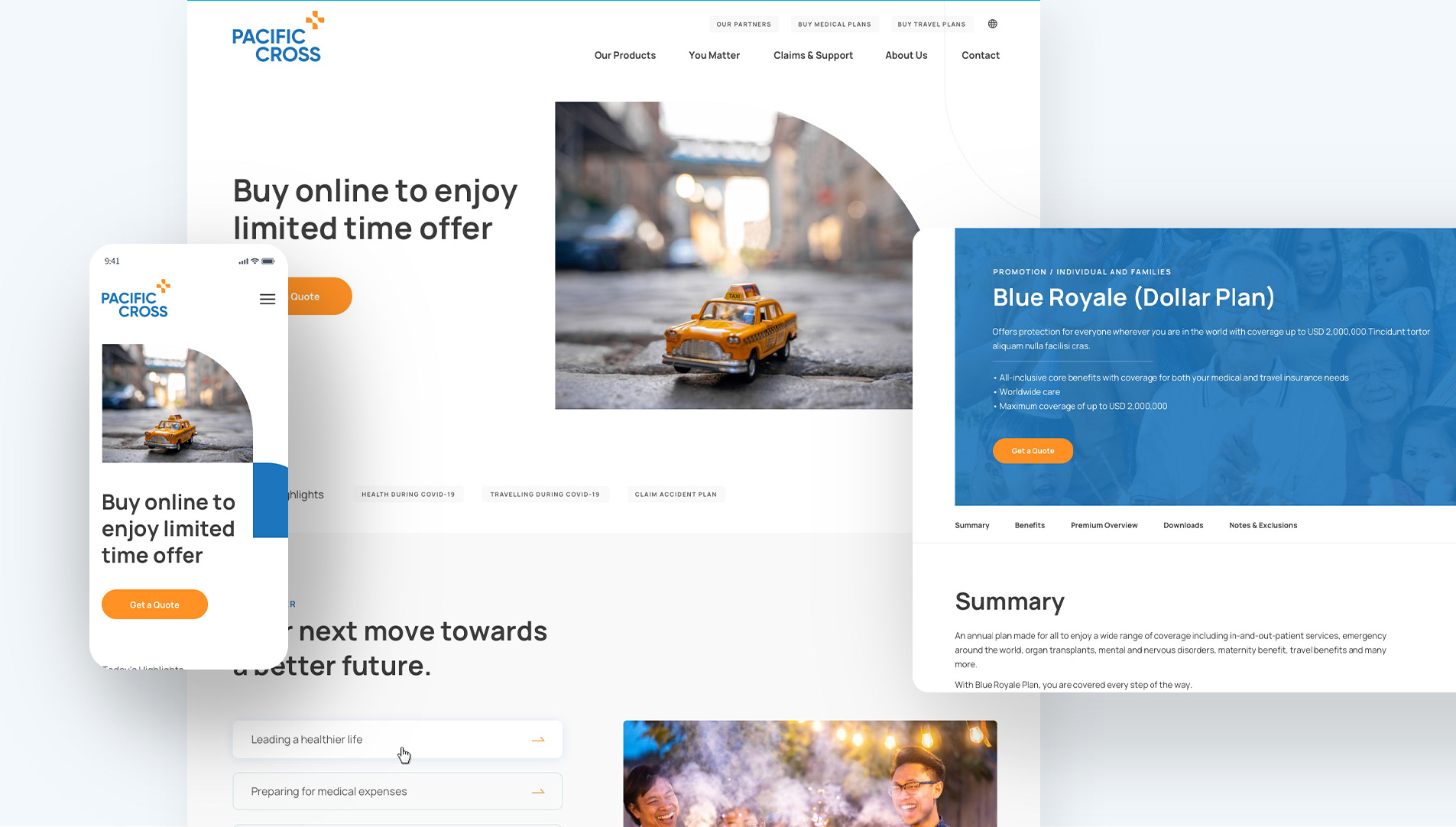
- 03
Built a visual language around warmth and credibility instead of the default 'insurance blue with stock photography of smiling families'. Clean typography, generous white space, purposeful use of the brand's orange as a single action signal, and photography that felt human rather than corporate — a site that felt made with care, because that's what you want to believe about the company protecting your health.
Outcome
Delivered a responsive web and mobile design system covering all key pages — homepage, product pages, plan detail, hospital finder, claims, and contact — designed across three distinct user journeys without fragmenting the visual experience. The mobile experience was designed as a first-class surface, not a scaled-down desktop. Key takeaway: trust is a design material. In insurance, people are deciding whether to hand over money for something they hope they never use. Every visual and structural decision either builds or erodes that trust — restraint, clarity, and warmth work harder than visual complexity in this context.